Buy-in to Chicago’s neighborhood grammar schools

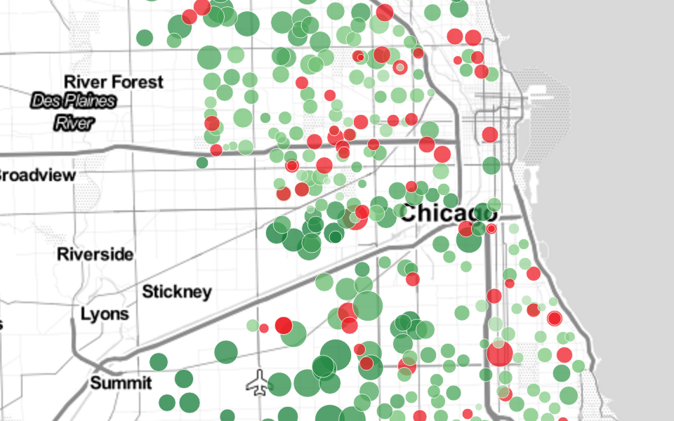
A map showing how the percentage of students attending their neighborhood school changed from 2001 to 2014. The map not only takes into account attendance changes at schools, but whether schools moved or closed. Map is built using leaflet and D3, with data analysis done in python using Pandas. Part of a larger package that won first prize for data journalism from the Education Writers Association.